Your booking page is the moment of truth. Someone has heard about you, clicked a link and is ready to commit time and money — and in the next thirty seconds your page either makes that easy or quietly loses them. A well-designed booking page is one of the highest-leverage things any appointment business can build, because it works for you around the clock.
The good news is that high-converting booking pages all share the same DNA. Once you can see the pattern, it's easy to copy. This guide breaks down the anatomy of a great page, then walks through twelve concrete layout examples by business type so you can borrow the choices that fit you.
Let's start with what a converting page actually looks like.
Design matters most when it supports a clear booking flow. For the full operational checklist behind the page design, see our complete online booking setup guide.
The anatomy of a high-converting booking page
Before we get to specific examples, here's the shape almost every great booking page follows. Whatever your trade, these are the elements that turn visitors into bookings.

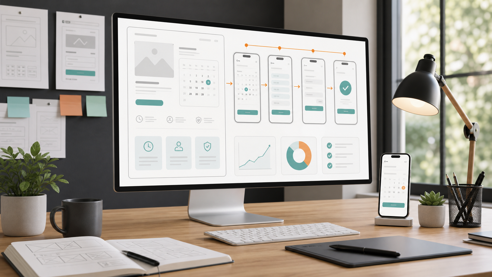
Notice what's doing the work here. The brand and what you do are obvious in a glance. Services and prices are visible before anyone logs in or fills in a form. A live calendar shows only real, bookable slots. And there's exactly one thing to do next: book. No clutter, no detours.
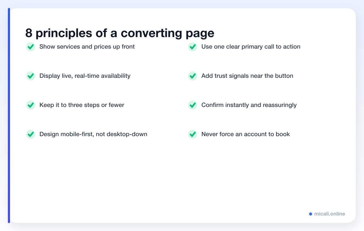
Show services and prices up front
The single most common conversion killer is hiding prices behind an "enquire" form. People want to know what something costs before they invest effort. List your services with clear prices and durations, and you remove the biggest reason someone hesitates.
Show live availability, not a contact form
A real-time calendar that shows only genuinely open slots does two jobs: it proves you have space, and it lets people self-serve at midnight when your phone is off. Never show slots that are already taken — nothing erodes trust faster than a "sorry, that's gone" message after someone has chosen a time.
Keep it to three steps or fewer
Every extra step is a chance to lose someone. The ideal flow is pick a service, pick a time, confirm. Ask only for what you genuinely need — usually a name, a mobile number and an email. Long forms belong after the booking is secured, not before.
Design mobile-first
Most booking traffic now comes from a phone, often from an Instagram bio or a Google listing. If your page only feels right on a laptop, you're losing the majority of visitors. Big tap targets, a single column, and a button that's always reachable with a thumb make all the difference.
One primary call to action
A page with five buttons of equal weight has no call to action at all. Pick one primary action — Book now — and make it the boldest thing on the screen. Everything else is secondary.
Trust signals and a reassuring confirmation
A line of reviews, a real photo, your address and a clear cancellation policy near the button all quietly reduce anxiety. And the job isn't done at "Confirm": an instant, friendly confirmation with the date, time and an add-to-calendar link reassures people they got it right.
12 booking page layouts that convert
Principles are easier to apply when you can picture them. Here are twelve concrete layouts grouped by business type — each one a small variation on the same converting core.

Salon & barber: the service-first grid
Example 1 — the price-led menu. Salons win by treating the page like a menu. Lead with a grid of services, each showing a price and duration, then drop the visitor straight into a live calendar once they tap one. Because the cut, colour and treatment prices are all visible, people self-qualify and arrive ready to book.
Example 2 — the staff picker. Many clients have a favourite stylist. Adding a simple "any availability" or "choose your stylist" step after the service keeps the page short while still feeling personal. The key is that it's optional — never force a choice that slows the booking.
Clinic & dental: the trust-led layout
Example 3 — calm and reassuring. Health bookings carry more anxiety, so the design should feel calm and credible. A clean layout, a clear "new patient vs returning" split, and a short line about what to expect on a first visit all lower the barrier. Trust signals — registration details, a friendly photo, an address — earn their place near the button.
Example 4 — the intake form, done right. Clinics often need medical details, but those belong after the slot is secured. Book the time first, then collect the intake form on the confirmation screen so the commitment is locked in before any paperwork appears.
Fitness studio: the live timetable
Example 5 — the class grid. Studios sell sessions, not one-off appointments, so the page is a weekly timetable. Show each class with a time, an instructor and a live "spots left" count. Scarcity is honest here and it nudges people to book the busy class now rather than later.
Example 6 — the waiting list. Popular classes fill up, and an empty "fully booked" message is a dead end. A built-in waiting list turns it into a second chance: when someone cancels, the next person is offered the spot automatically. The page feels generous instead of closed.
Tutor & coach: the single-service page
Example 7 — one service, one calendar. Tutors and coaches usually sell one thing — their time. The cleanest layout skips the service grid entirely and opens straight onto a weekly availability picker. A short "about me" line and a price per session is all the context needed.
Example 8 — the package upsell. Coaches often sell blocks of sessions. Offering a single session and a discounted package side by side, with the package gently highlighted, lifts average value without adding steps. Memberships handle the recurring side once someone commits.
Photographer: the visual-first page
Example 9 — let the work sell. For photographers the portfolio is the sales pitch, so the layout leads with images, then offers clear shoot packages with prices. The booking calendar sits one tap away. Beautiful work plus visible pricing removes the awkward "how much?" email entirely.
Example 10 — the deposit step. Shoots are high-value and easy to flake on, so a small deposit at booking is normal and expected. Built into the flow, it filters out tyre-kickers and protects the date without any awkward conversation.
Restaurant & event: the date-first layout
Example 11 — party size, then time. Restaurants flip the order: ask for the date and party size first, then show available times. It mirrors how people actually think about a booking and keeps the page to a single, fast screen.
Example 12 — the event ticket. For tasting menus, classes or one-off events, the page becomes a simple ticketed slot with a clear capacity, a price and a confirmation. A waiting list catches demand once the event sells out, so no interest is wasted.
Across all twelve, the spine is identical: clear prices, live availability, few steps, one button. The differences are just emphasis. For more on choosing the right tool, see our booking software guides, or browse advice by industry.
Conversion do's and don'ts
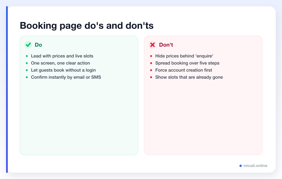
Most underperforming booking pages fail for the same handful of reasons. Here's the short version of what to do and what to avoid.
Common mistakes that quietly cost bookings
- Hiding prices. "Contact us for pricing" sends ready-to-buy people to a competitor who simply shows the number.
- Forcing an account. Making someone create a login before they can book is the fastest way to lose a guest. Let people book first; an account can come later, if at all.
- Too many steps. Every extra screen, field and click sheds visitors. If a field doesn't change whether the booking can happen, move it to later.
- Stale availability. Showing times that are already booked, or that the page can't actually honour, breaks trust instantly.
- No confirmation. A booking that ends in silence feels broken. An instant email or SMS confirmation is part of the design, not an afterthought.
- A noisy page. Five competing buttons, autoplay video and pop-ups all distract from the one thing you want: a confirmed booking.
If you only fix one thing this week, show your prices and a live calendar on the same screen. That single change removes the two biggest reasons people hesitate.
Frequently asked questions
What makes a booking page convert?
Clarity and speed. The pages that convert best show services and prices up front, display live availability, ask for the minimum information, work beautifully on mobile and offer a single, obvious primary button. Remove friction and reasons to hesitate, and more visitors finish the booking.
Should I show prices on my booking page?
Almost always, yes. Hidden pricing is one of the biggest conversion killers because people don't want to start a process without knowing the cost. Showing clear prices also pre-qualifies visitors, so the people who book are more likely to show up.
How many steps should booking take?
Aim for three or fewer: pick a service, pick a time, confirm. Each additional step loses some visitors, so collect only what you truly need to make the booking and gather anything else — like intake forms — after the slot is secured.
Do I need a separate page for mobile?
No — you need a page that's designed mobile-first and adapts to any screen. Since most booking traffic arrives from a phone, the mobile experience should be the priority, with large tap targets, a single column and an always-reachable button.
How do I make my own booking page?
You don't need a designer or developer. A platform like micali.online gives you a hosted booking page with your services, prices, live availability, instant confirmations and automated reminders built in — so you get every principle in this guide without writing a line of code.
The bottom line
A booking page that converts isn't about clever design tricks — it's about removing friction. Show your prices, show real availability, keep it to a few mobile-friendly steps, point at one clear button and confirm instantly. Match those fundamentals to the layout that fits your trade, whether that's a salon service grid or a fitness timetable, and your page will quietly book appointments while you sleep.
Want a page that already does all of this? Create your free micali.online booking page in minutes — no credit card required — and start taking bookings today.