A booking page is the most important page your business has — and most owners never give it a second thought. It's where a casual visitor decides, in a few seconds, whether to book you now or close the tab and try someone else. Get it right and bookings arrive while you sleep. Get it wrong and you're back to phone tag and missed calls.
The good news is that excellent booking pages are not a mystery. Across wildly different industries, the best ones share the same handful of traits. In this guide we tear down nine booking page examples — from hair salons to pet groomers — and pull out exactly what each does well and what you can copy.
These are illustrative archetypes rather than named third-party sites, so you can focus on the principles rather than someone else's brand. Let's start with the page everyone judges first: the salon.
What a great booking page actually does
Before the examples, it helps to name the job. A great booking page removes every reason to hesitate and every step that isn't strictly necessary. It answers three silent questions instantly: what do you offer, when are you free, and how much will it cost? Then it makes saying yes a single tap.
Everything below is a variation on that theme. Watch how each industry solves the same problem with a slightly different emphasis.
1. Hair salon — services and prices up front

The standout salon page leads with a clean list of services, each with a price and a duration. There's no "call for pricing", no PDF menu to download — just cut & finish, colour, balayage, blow-dry, the cost, and how long it takes. That transparency does two jobs: it filters out mismatched enquiries and it builds trust before the visitor has committed to anything.
Below the services sits a live calendar showing real open slots for the chosen stylist, not a contact form that promises someone will "get back to you". What to copy: show prices and durations next to every service, and let people pick a real time without waiting on a reply.
2. Barber — speed and a single tap
A great barber page is ruthless about speed. The whole flow is built for a thumb on a phone during a lunch break: pick a service, pick the next free slot, confirm. There are usually only three or four services, big tappable buttons, and a prominent "Book now" that never moves out of reach.
What to copy: strip your booking flow to the fewest possible steps. If a returning client can rebook their usual cut in under thirty seconds, you've nailed it.
3. Beauty & nails — visual menu and add-ons
Nail and beauty pages lean visual. The best ones pair a short, scannable service list with the option to bundle add-ons — gel finish, nail art, a brow tidy — right inside the booking flow, so the average ticket grows without any upselling pressure. Crucially, the add-ons are presented as easy checkboxes, not a separate phone conversation.
What to copy: let clients build their own appointment with optional extras at the point of booking. It lifts revenue and reduces awkward in-chair conversations.
4. Massage & spa — calm, clarity and deposits
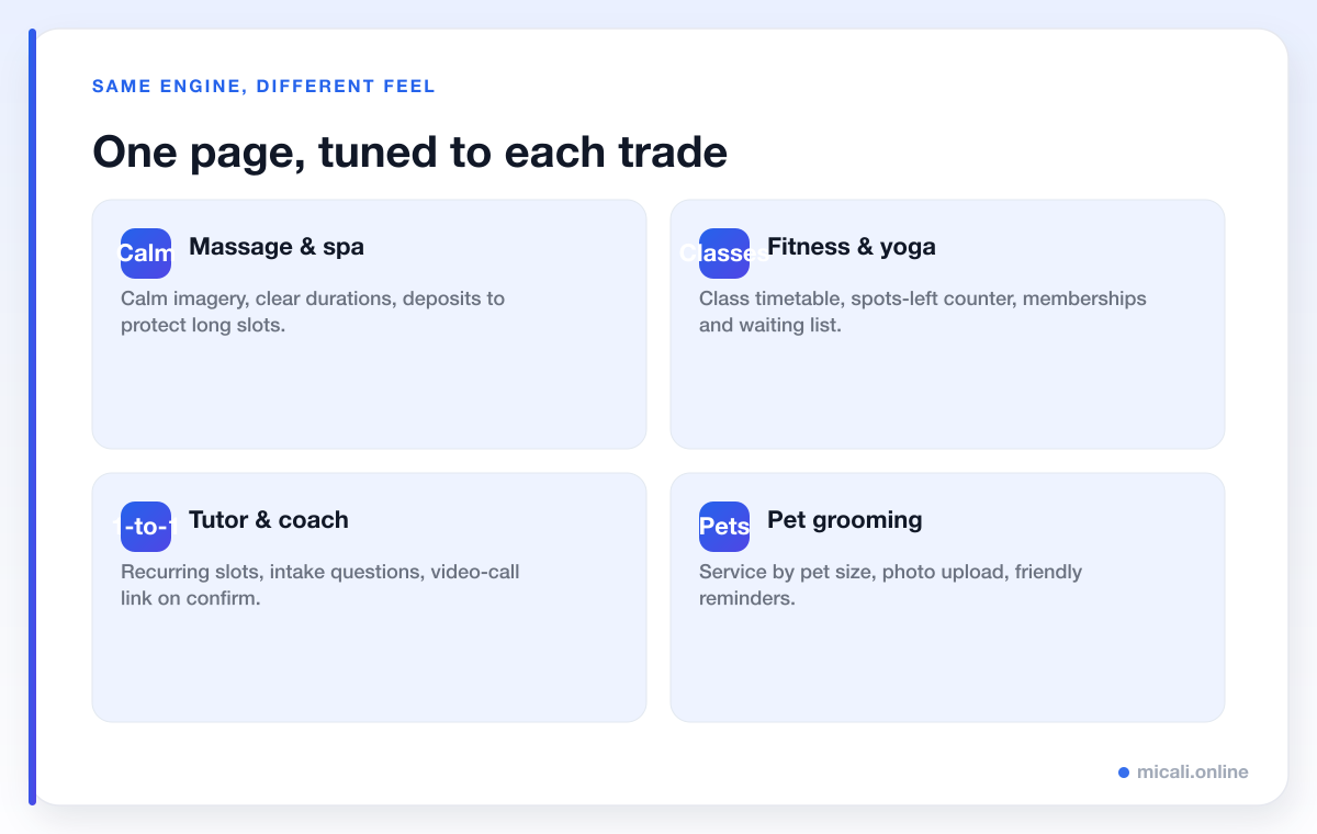
Spa and massage pages set a calm tone — soft imagery, plenty of white space — but the real cleverness is operational. Treatments are long and expensive to leave empty, so the best pages take a deposit at booking and state the cancellation window clearly, right next to the button. That single change protects the most valuable slots in the calendar.
What to copy: for any long or premium service, ask for a deposit or hold a card on file, and make the cancellation policy visible before the client confirms.
5. Dental clinic — trust signals and intake forms
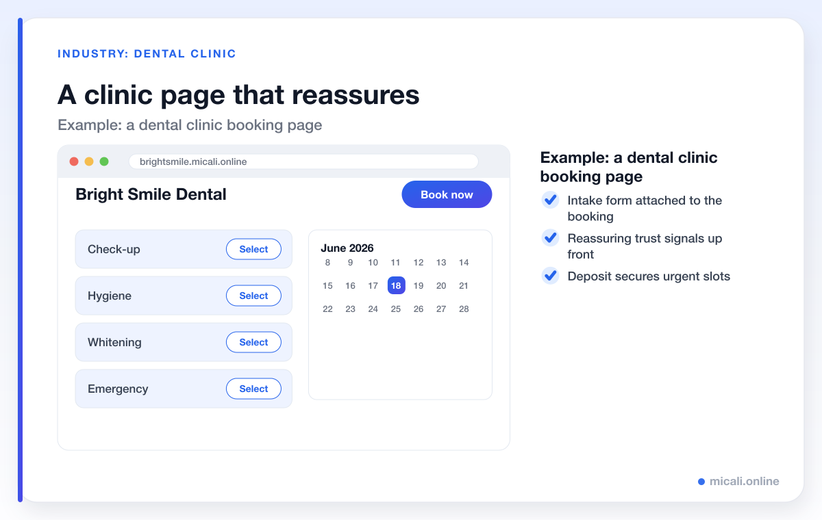
Healthcare booking is a different emotional register: people want reassurance. The best clinic page surfaces trust signals near the call to action — qualifications, a friendly photo of the team, a line about new-patient welcome — and attaches a short intake form to the booking so the clinician arrives prepared. Notice the brand and services are deliberately worlds apart from the salon above: check-up, hygiene, whitening, emergency, not haircuts.
What to copy: place your credentials and a warm photo close to the booking button, and collect the information you need with a form attached to the appointment rather than a phone call afterwards.
6. Fitness & yoga studio — timetables and spots left
Studios book classes, not one-to-one slots, so their pages revolve around a timetable. The best ones show a week-at-a-glance grid with a live "spots left" counter on each class — scarcity that's honest and genuinely useful. Memberships and class packs are sold on the same page, and a waiting list quietly backfills any cancellations.
What to copy: if you run group sessions, show capacity in real time and turn on a waiting list so a drop-out instantly becomes someone else's confirmed spot.
7. Tutor & coach — recurring slots and questions
Tutors and coaches sell time and outcomes. The strongest pages make it easy to book a recurring weekly slot, ask a couple of intake questions (subject, level, goals) up front, and drop a video-call link into the confirmation automatically. The whole experience signals "I'm organised and I value your time" before the first session even starts.
What to copy: offer recurring bookings for regular clients and gather context with a short form so every session starts productive.
8. Photographer — packages and a deposit
Photography pages frame the work first — a tight gallery — then move quickly to clearly priced packages rather than vague "enquire now" buttons. Because sessions are high-value and date-specific, the best pages secure the date with a deposit at booking, so a held Saturday is a committed Saturday.
What to copy: productise your services into named packages with prices, and protect popular dates with a deposit.
9. Pet grooming — service by size, friendly tone
Grooming pages get the details right: services priced by pet size or breed, a field for the dog's name, and the option to upload a photo so the groomer knows what's arriving. The tone is warm and the reminders are friendlier than most — because a forgotten grooming appointment is a long gap to refill.
What to copy: tailor your service options to how your work actually varies, and use a custom field or two to capture what you need before the visit.
The traits the best booking pages share
Strip away the industry styling and the same eight traits show up again and again. If your page does these, you're already ahead of most competitors.
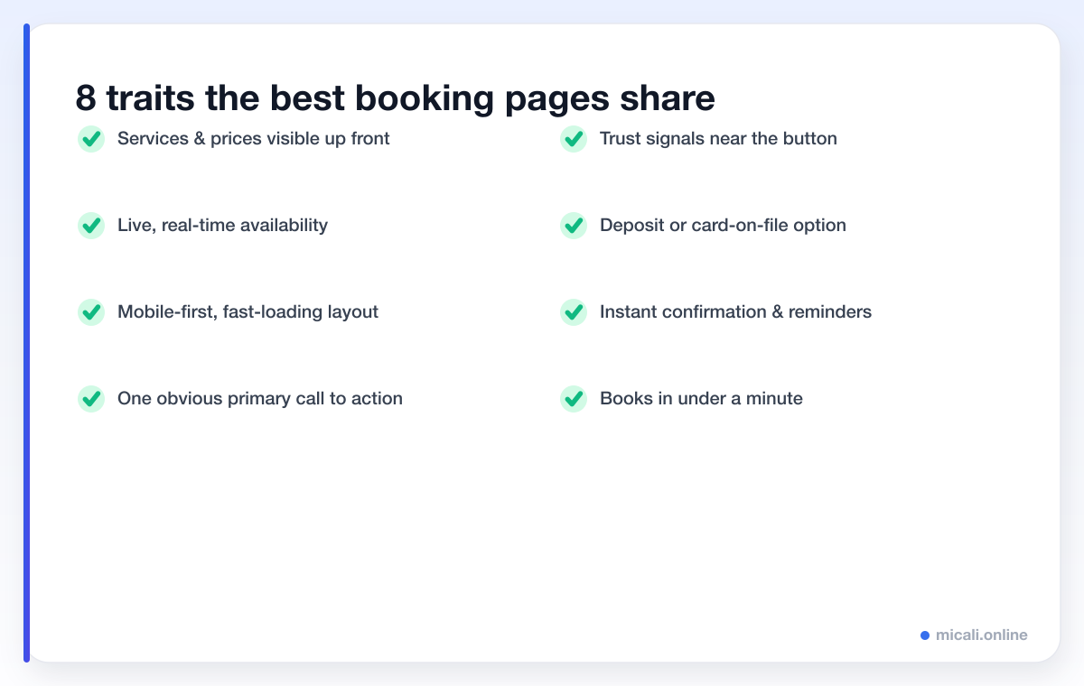
The thread running through all of them is removing friction. Every visible price, every live slot, every trust signal next to the button removes one more reason to hesitate. The best pages aren't the prettiest — they're the ones where booking feels obvious and effortless.
If a first-time visitor can understand what you offer, see when you're free, and confirm an appointment in under a minute — on their phone, without calling you — you have an excellent booking page.
A quick self-audit for your own page
Open your current booking page on your phone and check it honestly against this list:
- Clarity: are services, prices and durations visible without scrolling for ages?
- Availability: can someone see real open times, or are they sent to a contact form?
- Speed: how many taps from landing to confirmed? Aim for under five.
- Trust: is there a photo, a review or a credential near the button?
- Commitment: for valuable slots, do you take a deposit or hold a card?
- Follow-up: does the client get an instant confirmation and automated reminders?
Anything you answered "no" to is a quick win. For more on the follow-up side, our automation guides cover reminders and confirmations in depth.
How to build a booking page like these — free
Every example above is built from the same building blocks, and you don't need a designer or a developer to assemble them. micali.online gives you a hosted booking page on your own subdomain — for instance yoursalon.micali.online — with services and prices up front, live real-time availability, a mobile-first layout, deposits and card-on-file, custom intake forms, memberships, a waiting list, and instant confirmations with automated email and SMS reminders built in.
You can have a page live in minutes, with no credit card required, and adapt it to your trade — whether that's a salon, a clinic, a studio or a grooming room. Browse more by sector in our industry guides.
Frequently asked questions
What makes a booking page convert well?
Clarity and speed. The pages that convert best show services, prices and live availability up front, work flawlessly on a phone, and let a visitor confirm in a handful of taps. Remove every unnecessary step and every unanswered question, and conversion takes care of itself.
Should my booking page show prices?
In almost every case, yes. Visible pricing builds trust, filters out mismatched enquiries, and removes a reason to hesitate. "Call for pricing" sends a chunk of ready-to-book visitors straight to a competitor whose prices they can see.
Do I need a separate page for each service or industry?
No. A single booking page can list multiple services, durations and prices, and the same platform adapts to very different trades. The salon and dental examples above run on the same engine — only the services, branding and forms differ.
Is a free booking page good enough for a real business?
Yes. A free micali.online booking page includes live availability, deposits, custom forms, a waiting list and automated reminders — the same features that make the examples in this guide work. You can always add more as you grow.
How do I get people to my booking page?
Link to it everywhere a customer might look: your Instagram bio, Google Business Profile, website button, email signature and reply messages. The easier it is to reach, the more it works for you. Our marketing guides go deeper on this.
The bottom line
The best booking pages across every industry do the same few things well: they show what you offer and what it costs, reveal real availability, work beautifully on a phone, build trust right next to a single clear button, and confirm instantly. None of it requires a big budget — just intent.
Ready to build one? Create your free micali.online booking page today and turn casual visitors into confirmed appointments.