The best hair-salon websites all feel effortless to book on. You land on the page, you can see the prices, you tap a couple of times, and you are booked — often before you have finished your coffee. The worst ones make you call during opening hours or fill in a form and wait for someone to email you back.
To work out what separates the two, we reviewed around 50 hair-salon websites with genuinely great booking experiences and looked for the patterns they had in common. This is not a gallery of 50 named brands or screenshots — it is a distilled study of the recurring UX patterns the best salon sites share, and exactly how to copy each one onto your own site.
If you run a salon, treat the rest of this article as a checklist you can steal. Most of these patterns take minutes to set up and every one of them removes a reason for a client to give up before they book.
Use these UX patterns together with our complete online booking setup guide to turn design inspiration into an actual booking workflow for your business.
What a great salon booking page looks like
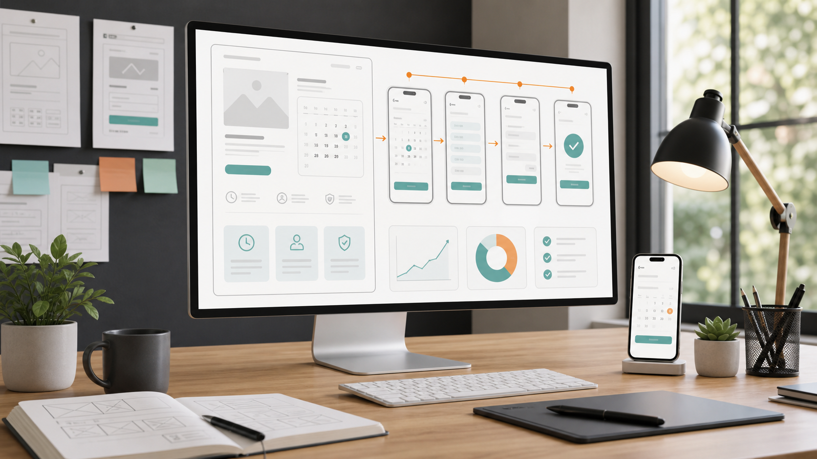
Before the patterns, here is the target. A great salon booking page puts the most important thing — booking — front and centre, shows real prices and durations, and lets the client pick a real, live slot rather than "requesting" a time and hoping.

Notice what is doing the work: a prominent Book now, services with prices, and a calendar of slots the client can actually tap. Everything else on the page — gallery, story, team — supports that one action.
The booking-UX criteria the best salon sites meet
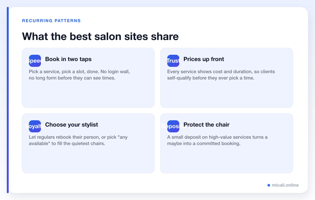
Across the sites we looked at, the same handful of criteria came up again and again. If a salon page hits most of these, it tends to convert browsers into booked appointments.

The good news is that none of these require a designer or a developer. Below we break down each pattern: what the great salons do, and how to copy it.
The patterns worth stealing
1. A prominent "Book now" above the fold
What great salons do: the single most repeated pattern. A clear, high-contrast Book now button is visible the moment the page loads, on every page, and it never moves. On mobile it often sticks to the bottom of the screen so it follows the client as they scroll.
How to copy it: add one obvious booking button in your header and repeat it after each section. Resist the urge to bury it under your story or a slideshow. The rule of thumb: a first-time visitor should be able to start booking within one second of arriving.
2. Services with prices and durations
What great salons do: every service lists a price and how long it takes — "Cut & finish · 45 min · £40", "Balayage · 2.5 hrs · from £120". Clients self-qualify before they pick a time, which means fewer awkward conversations and fewer mismatched bookings.
How to copy it: publish your menu with real numbers. "From" pricing is fine for colour work that varies by length, but show something. Hiding prices behind "contact us" is the fastest way to lose a busy client to the salon down the road that just told them.
3. Choose your stylist — or "any available"
What great salons do: regulars can rebook the exact stylist they trust, while new clients can pick "any available" and get the soonest slot. This single choice respects loyalty and fills the quietest chairs.
How to copy it: add your team to your booking page with a short bio and photo, and offer an "any available" option for clients who just want the earliest appointment. It also protects you: when a stylist is off, those clients flow to whoever is free instead of bouncing.
4. Live, real-time availability
What great salons do: the calendar shows genuine open slots, updated in real time, and a booked time disappears instantly so two people never grab it. No "we'll confirm by email" — the slot is theirs the moment they tap it.
How to copy it: use a real booking system rather than a contact form. A form that emails you a request is not booking — it is homework for both of you. Live availability removes the back-and-forth entirely.
5. A mobile-first, 2-3 tap flow
What great salons do: most salon bookings happen on a phone, often in the evening. The best flows get from "I want to book" to "you're booked" in two or three taps: pick a service, pick a slot, confirm. No pinch-zooming, no tiny dropdowns, no account wall before the client can even see times.
How to copy it: test your own booking flow on your phone and count the taps. If it takes more than about three, something can be cut. Let people see live times before you ask for any details, and never force someone to create an account just to book.
6. A deposit to protect the chair
What great salons do: for long, high-value services like balayage or a full colour, the best salons take a small deposit or hold a card on file. It costs them almost nothing and turns a casual "maybe" into a committed booking, which keeps expensive chair time from sitting empty.
How to copy it: add a modest deposit to your longest services — it does not need to be the full price. Pair it with a clear, friendly cancellation policy shown at booking. For more on this, see our customer-management guides.
7. Instant confirmation, then reminders
What great salons do: the second a client books, they get a confirmation by email and text with the date, time, stylist and an add-to-calendar link. Then automated reminders land the day before and a couple of hours before — which is the single biggest lever on no-shows.
How to copy it: turn on automatic confirmations and reminders. Collect a mobile number at booking so SMS — which is read within minutes — can do its job. A simple, copyable reminder looks like this:
Hi {first_name}! Reminder: your {service} with {stylist} is tomorrow at {time}. Reply C to confirm or tap to reschedule: {link}. See you soon — {salon}.
8. One-tap rescheduling
What great salons do: plans change. Instead of forcing a client to cancel and rebook from scratch — or worse, just not turn up — every confirmation and reminder carries a one-tap reschedule link. A would-be no-show becomes a simple time change, and you keep the client and the revenue.
How to copy it: make sure your reminders include a reschedule link, not just a cancel button. Most people would happily move an appointment if it took one tap; many ghost simply because it felt awkward.
9. Reviews and social proof near the button
What great salons do: a row of star ratings, a few short testimonials, and a gallery of real work sit close to the booking button — so the moment a client is convinced, the next thing they see is how to book.
How to copy it: place two or three genuine reviews and a handful of before-and-after photos right above or beside your Book now. Proof builds confidence; confidence books appointments.
10. Clear, friendly policies
What great salons do: cancellation windows, deposit terms and lateness rules are stated plainly and kindly at the point of booking — never sprung on the client afterwards. People respect boundaries they were told about up front.
How to copy it: write a one-line policy in plain English — "Please give us 24 hours' notice to change or cancel" — and show it at booking and in reminders. For wording you can lift, browse our policy and message templates.
Common booking-UX mistakes to avoid
The flip side is just as instructive. These are the patterns that quietly cost salons bookings — and every one of the sites we admired had designed them out.
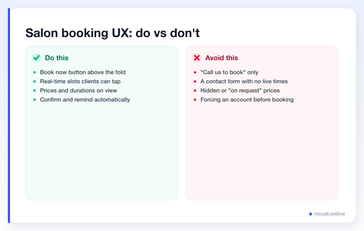
- "Call us to book" as the only option. Many clients book outside opening hours and will simply not phone. If calling is the only route, you lose them.
- A contact form instead of live slots. A form that emails you a request is not online booking; it is a slower version of a phone call with extra steps.
- Hidden or "on request" prices. Busy clients want to know the cost before they commit. No price often reads as "expensive", and they move on.
- Forcing an account before booking. Asking someone to create a login just to see times is one of the biggest drop-off points there is. Let them book first.
- A booking page that fights the phone. Tiny tap targets, pinch-zooming and clunky dropdowns kill mobile bookings. Most of your traffic is on a phone — design for it first.
- No confirmation or reminders. Silence after booking breeds doubt and no-shows. An instant confirmation and a timely reminder fix both.
How micali.online gives salons this UX for free
Here is the good news: you do not need a custom website or a developer to get every pattern above. micali.online gives hair salons a free booking page that ships with great booking UX built in.
You get a prominent Book now page on your own subdomain (like yoursalon.micali.online), a service menu with prices and durations, choose-your-stylist with an "any available" option, live real-time availability, a mobile-first 2-3 tap flow, optional deposits to protect high-value chairs, instant email and SMS confirmations, automated reminders and one-tap rescheduling. There is no credit card required to start, and you can be taking bookings the same day.
Frequently asked questions
What is the most important booking-UX pattern for a salon?
A prominent Book now backed by live, real-time availability. If a client cannot see and grab a real slot in a few taps, every other improvement matters less. Make booking the easiest thing to do on the page.
Should hair salons show prices online?
Yes. Showing prices and durations on each service lets clients self-qualify and builds trust. "From" pricing is fine for colour work that varies, but hidden prices usually read as expensive and cost you bookings.
Do salons need a deposit to reduce no-shows?
A small deposit on long, high-value services is one of the strongest no-show deterrents, because it turns a casual booking into a committed one. Pair it with a clear, friendly cancellation policy so it feels fair rather than punitive.
Is a contact form good enough for taking bookings?
Not really. A form that emails you a request still needs a human to reply and confirm, which is slow for the client and admin for you. Live availability that books the slot instantly is a far better experience for both sides.
How many taps should booking take on mobile?
Aim for two to three: pick a service, pick a slot, confirm. Let clients see live times before you ask for personal details, and never force them to create an account first.
The bottom line
Great salon booking UX is not a mystery — it is a short list of patterns the best sites all share. Put Book now above the fold, show prices and durations, let clients choose their stylist, offer live slots in a 2-3 tap mobile flow, protect the chair with deposits, and confirm, remind and reschedule automatically. Steal those, and design out the mistakes, and more browsers turn into booked appointments.
Want this UX without building anything? Create your free micali.online salon booking page and start taking bookings today.